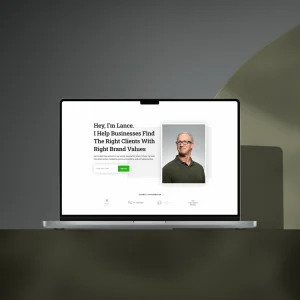
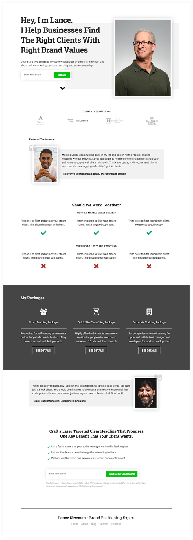
I present my premium Thrive Architect template for homepage. This one is made for all consultants/coaches or anyone who sells their services to a set of clients.
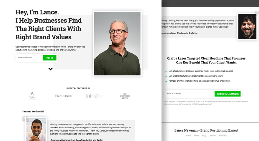
The above the fold design is heavily inspired by Authority Pro theme homepage from StudioPress.
Who is this for?
This uses a minimal style, typography heavy design. It fits anyone who wants to appear professional, experienced and established yet friendly. I recommend any consultants out there to offer lead magnets to attract clients. Its a great way to build trust, establish authority and show your expertise.
-
Product on sale
 Coach Consultant Homepage Thrive Architect TemplateOriginal price was: 19,00 €.9,90 €Current price is: 9,90 €.
How to use this template effectively?
- Replace the top headline to be your own. But carefully choose it to emphasis on your positioning. Good positioning attracts the right clients and repels the bad ones. Also helps you focus on a niche instead of trying to appeal to everyone.
- You can either use the CTA on top, to get them on your newsletter (please start one if you don’t have one yet). Or just replace with your desired choice of CTA. But I highly recommend creating a relevant free lead magnet that your potential client might want.
- Use the featured section to showcase your client’s logos if you don’t have publications/guest posts.
- Featured testimonial is key. Please get some testimonials from your old clients if you don’t have any. If you are starting out new, find some clients for discounted rate/free but make it clear that its in return for their testimonials and referral to more work from their connections. You can also ask for social media mentions if they like your services.
- Should we work together section attracts attention due the green and red elements. Write good copy to attract the clients you want, and repel the ones you don’t. This also makes you not look desperate and ready to take up any work.
- My packages is great to frame a few packages that will give an idea of the cost of your services. I suggest link the button to detailed pages
- In the bottom you can either offer another lead magnet, or simply highlight a feature of your service. Something your clients want. Once you have their attention, you the bulleted list to showcase details.
- Bottom section is your website menu. This page is an upside-down landing page template, so the menu is not on the top. As of writing this post, my own homepage is an upside down landing page and has proved extremely effective to get clients.
Preview the new template below
Consultant / Coach Homepage – Thrive Architect Page Template Demo

